Branding Case Study
RCSI & UCD MALAYSIA CAMPUS
Rediscover Its Excellence
A brand refresh for a leading medical institution to rediscover its excellence.
RUMC Introduction
Home for compassionate achievers.
If your kind heart is set for transforming lives via medical services, RCSI & UCD Malaysia Campus (RUMC) is all about that. RUMC is the first accredited private medical school in Malaysia. Recently, the College has been awarded the status of University by the Malaysian Ministry of Education (MOE) as a Foreign University Branch Campus. Being the only Irish University in the country, RUMC has always been providing unrivalled, quality and international medical education to aspiring doctors throughout the years.
Problem Statement
Formerly known as Penang Medical College (PMC), RUMC realizes the need for a higher level of recognition among prospective students. Also, with its recent achievement in obtaining the University status, the brand is due for a transformation. Hence, RUMC reached out to W3RK to help them through a creative brand refresh exercise, embrace a refreshed brand identity while retaining their positioning.
Strategy And Creative Rationale
Our primary goal is to highlight RUMC’s 20 years of collaborative organization with the two world-renowned medical universities in Ireland which are Royal College of Surgeons in Ireland (RCSI) and University College Dublin (UCD), bringing them up front-and-centre.
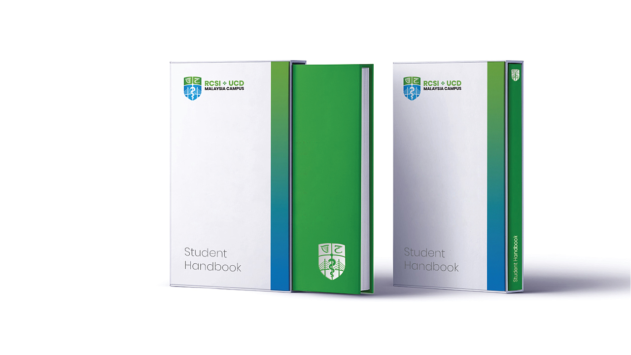
After consolidating various opinions and thorough analysis of their strengths and achievements, we went through a few iterations to come up with what would constitute their brand new identity. This included everything from a new logo to a set of brand identity system and a brand guideline. These guidelines are vital to ensure consistency, brand recall and recognition, which reinforces good relationships with key stakeholders over time.
We have redesigned their logo and a whole set of their corporate identity system, as well as a corporate brand guideline. These guidelines are crucial to build a strong brand presence and keep the brand consistent.
SCOPE OF WORK
Brand Refresh
Brand Strategy
Brand Identity
Brand Development
Brand Consultancy
Brand Management
Digital Marketing
Photography
Logo
Enclosed in the shape of a crest, the new logo composes of four specially drawn elements. The Harp and the Lancet are adopted from the UCD and RCSI logos respectively while the Rod of Asclepius is the symbol of medicine and healthcare. Behind the Rod of Asclepius lies the Penang bridge, the landmark of Penang, suggesting the location of RUMC campus.
In the logotype, the ‘+’ sign is derived from two arrows coming together, each representing RCSI and UCD. The space in between shows the union between both universities.
Tagline
Transcend borders, transform lives.
This is the narrative direction of RUMC which inspires everyone in RUMC to strive beyond physical boundaries and excellence to transform their lives and become compassionate doctors who will go on to transform the lives of others. It implies the idea that with RUMC’s programme bridging the best of both worlds, it will be an experience of a lifetime beyond learning for students.

Colour
Apart from logomark and tagline, colour too plays a crucial role in the rebranding process to sprinkle hints of their brand personality and core values in the right amount of dosage and at the right places.
By selecting Green, the colour of life as the brand colour, we aimed attying in with the brand’s tagline of transforming lives as well as representing the institution’s enthusiasm in bettering medical and healthcare services to contribute to the society. Also, we built a 4-colour supporting palette consisting of deep green, black, blue and deep blue to complement the green brand colour effectively and add variation to communications.
A specifically constructed gradient background fusing the green and the blue from the colour palette serves as the unique graphic element of our communications. It adds a bright and lively style to our visual language.
Typography
A simple yet strong sans serif font, Poppins, is chosen to represent the brand as it has a neat and trimmed look with subtle quirks in the details to provide the brand with a clear and confident voice.

Icons
Self-explanatory, icons can facilitate understanding of informational communications and help simplify information. For RUMC, we combined green and blue lines from their colour paletteto form the shape of the icons, making them contemporary and graphic while adding clarity to communications.
Outcome
The result of this rebranding exercise is a clear direction and narrative that helps RUMC reach their audience consistently and coherently. They are now set to tell their story with the refined identity through this new look, feel and tone.


Corporate Video
Digital Marketing & Social Media Management
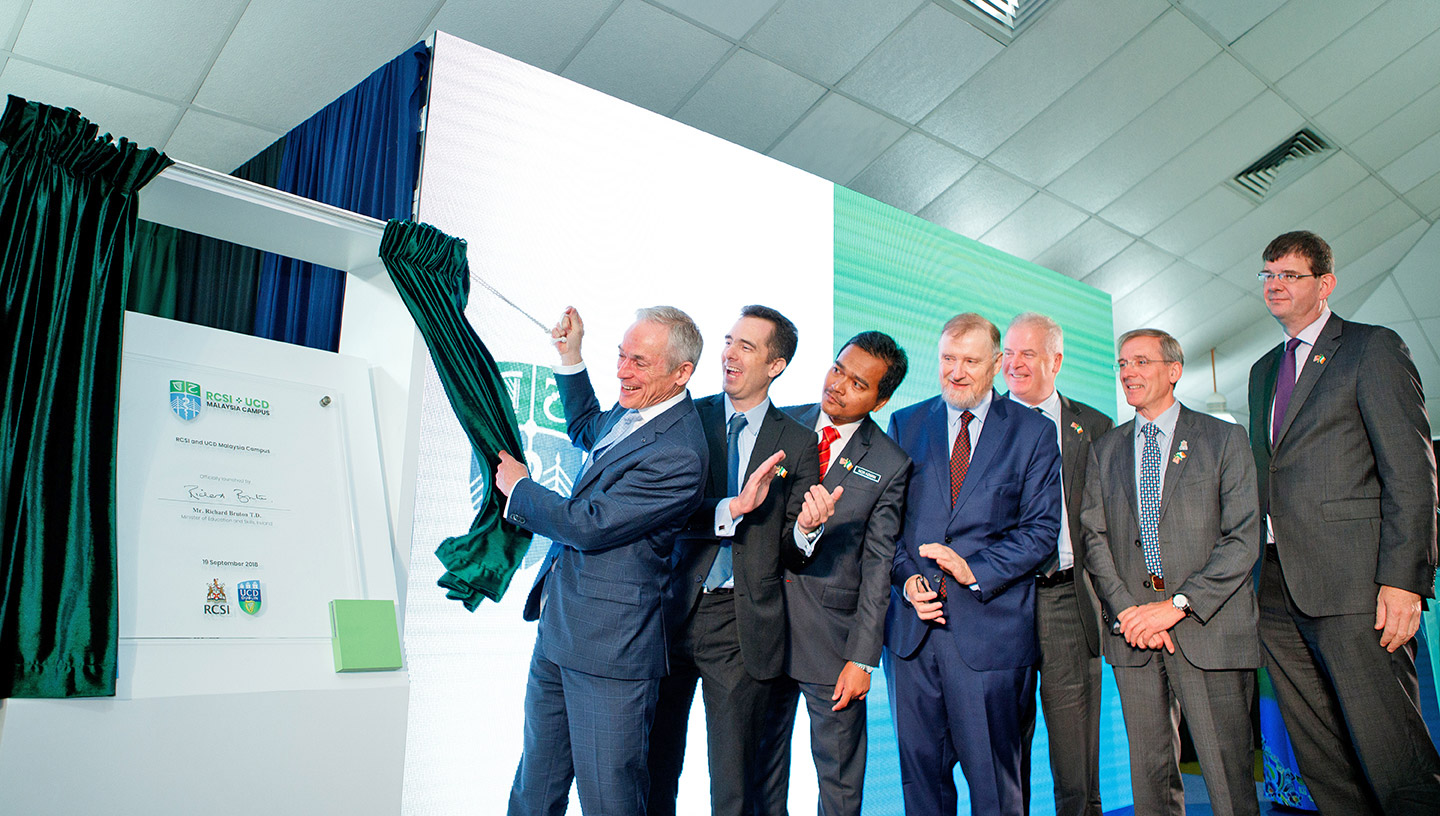
Road Show & Event


Photography
Photography is essential to capture the people of RUMC and then connect with their target audience beyond words.We defined their photographic imagery as a set of bright and natural images, placing emphasis on candid moments and directing focus to human beings, while complementing that with objects as supporting elements.


