Branding Case Study
BIG NUTS
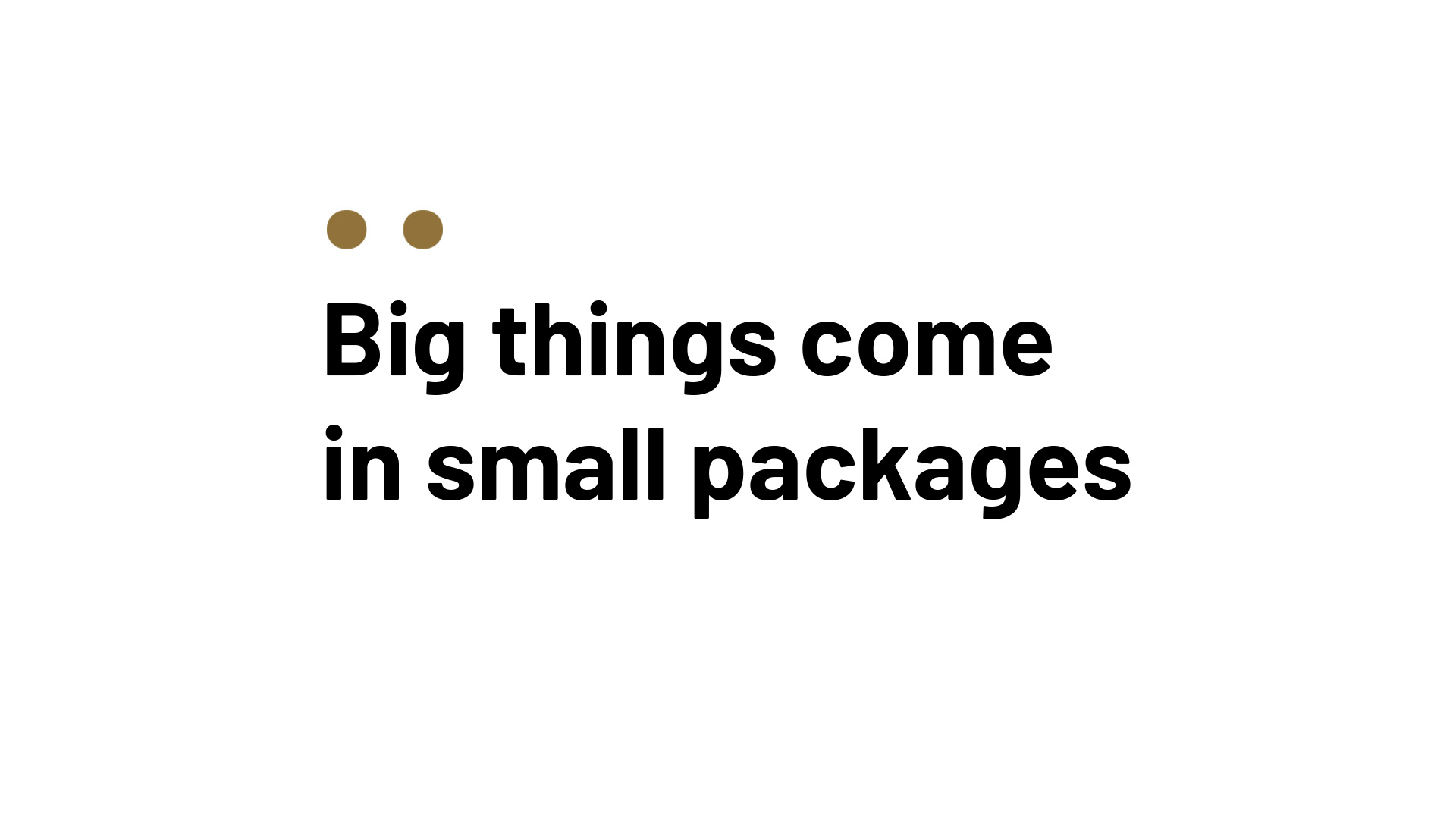
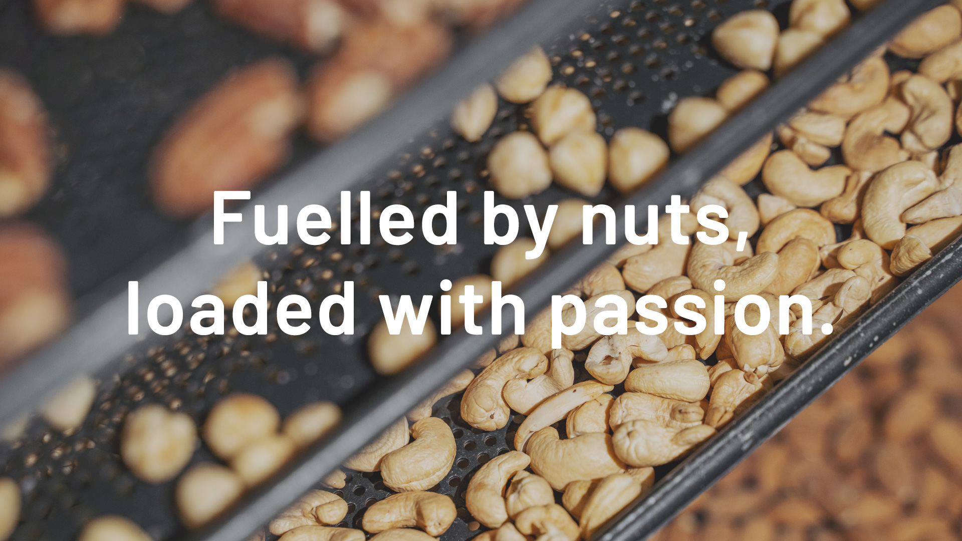
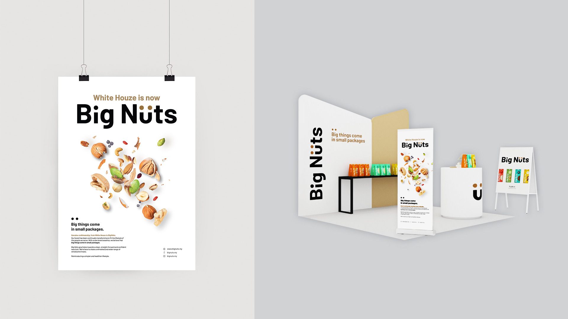
Big things come in small packages
Nuts for Big Nüts
Big Nüts is the brainchild of two health connoisseurs who wanted to share their passion of healthy eating with the world. Realising the need to expand their target audience, the duo sought our assistance to help the brand stand out from other health food competitors. Thus, we came up with a rebranding process that seeks to reposition the brand, from White Houze to Big Nüts, to stay fresh and cater to the ever growing demands of their new target audience.
SCOPE OF WORK
Rebrand
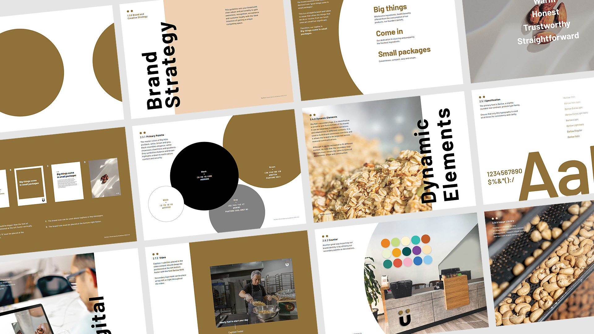
Brand Strategy
Brand Identity
Brand Development
Brand Consultancy
Brand Transition Campaign
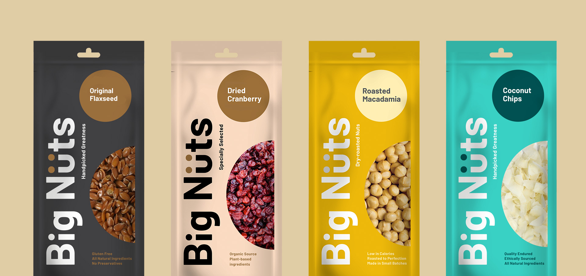
Product Packaging Design

Best Food and Beverage Packaging Designs
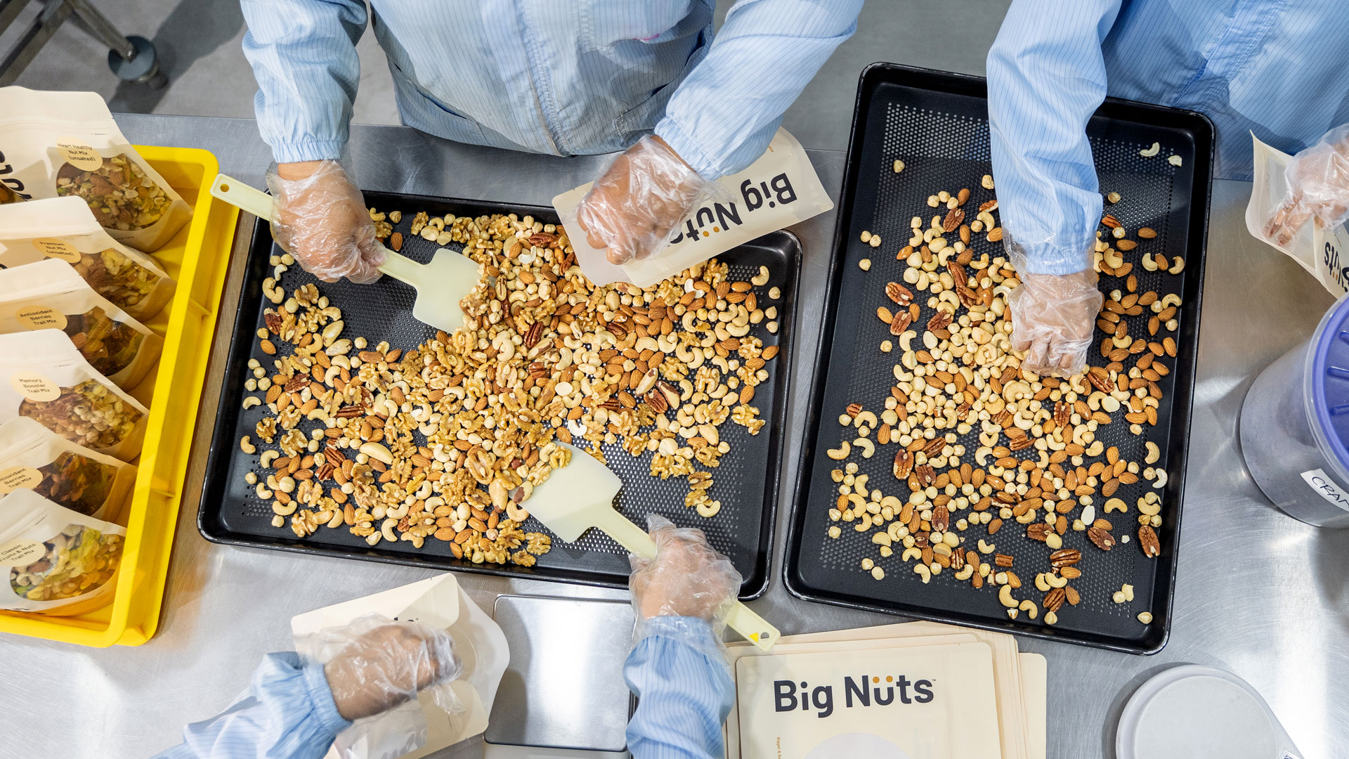
The Power of Two
We devised the new brand upon the founders' belief that staying healthy should be simple, pure and straightforward. We chose the Barlow font for its sleek and modern san-serif typeface that would offer contrast, clarity and simplicity to resonate with the younger millennials. We then turned the font bold to depict its new brand name - Big Nüts, big and bold, easy to locate and stand out when the product is on a shelf.
The Ü represents the two founders and their passion for healthy eating and most importantly the nut varieties they offer. The accented U (aka umlaut), or the pair of dots, depicts the core form of raw nuts and seeds while also symbolising togetherness. The uniqueness behind the brand mark sets them apart from other brands.
The main colours black, grey, white and brown were brought together to further enhance the identity. Black, grey and white for simplicity and purity, brown just because it's the colour of the nuts, as straightforward as it is. We then use a secondary colour palette of multi-colours as a fun and approachable way to represent the variety of products offered.
"The Ü represents the two founders and their passion for healthy eating and most importantly the nut varieties they offer. The accented U (aka umlaut), or the pair of dots, depicts the core form of raw nuts and seeds while also symbolising togetherness."


Expanding the Impact
To further expand the rebranding campaign, we worked on the physical mediums which include brand collaterals, stationeries, counter decorations and a series of packaging designs. These physical collaterals are part and parcel of the rebranding process and it is a creative way to reinforce the brand and spread Big Nüts’ name. In addition to that, we came up with the ideation for the sales gallery with a minimalist touch to elevate the buying experience for the consumers.
Big Nüts, Bigger Süccess
The rebranding exercise has given Big Nüts a new vibe and identity and it was a success because this new personality managed to resonate with the younger and health conscious millennials seeking for convenience and minimalism.


"This new personality managed to resonate with the younger and health conscious millennials seeking for convenience and minimalism."


What our client say
“W3RK definitely knows their game, the new brand speaks our identity loud and clear, allowing business growth as we are now able to reach out to more customers.”
Jason & Chris
Big Nüts Founders