
Branding Case Study
BIG NÜTS
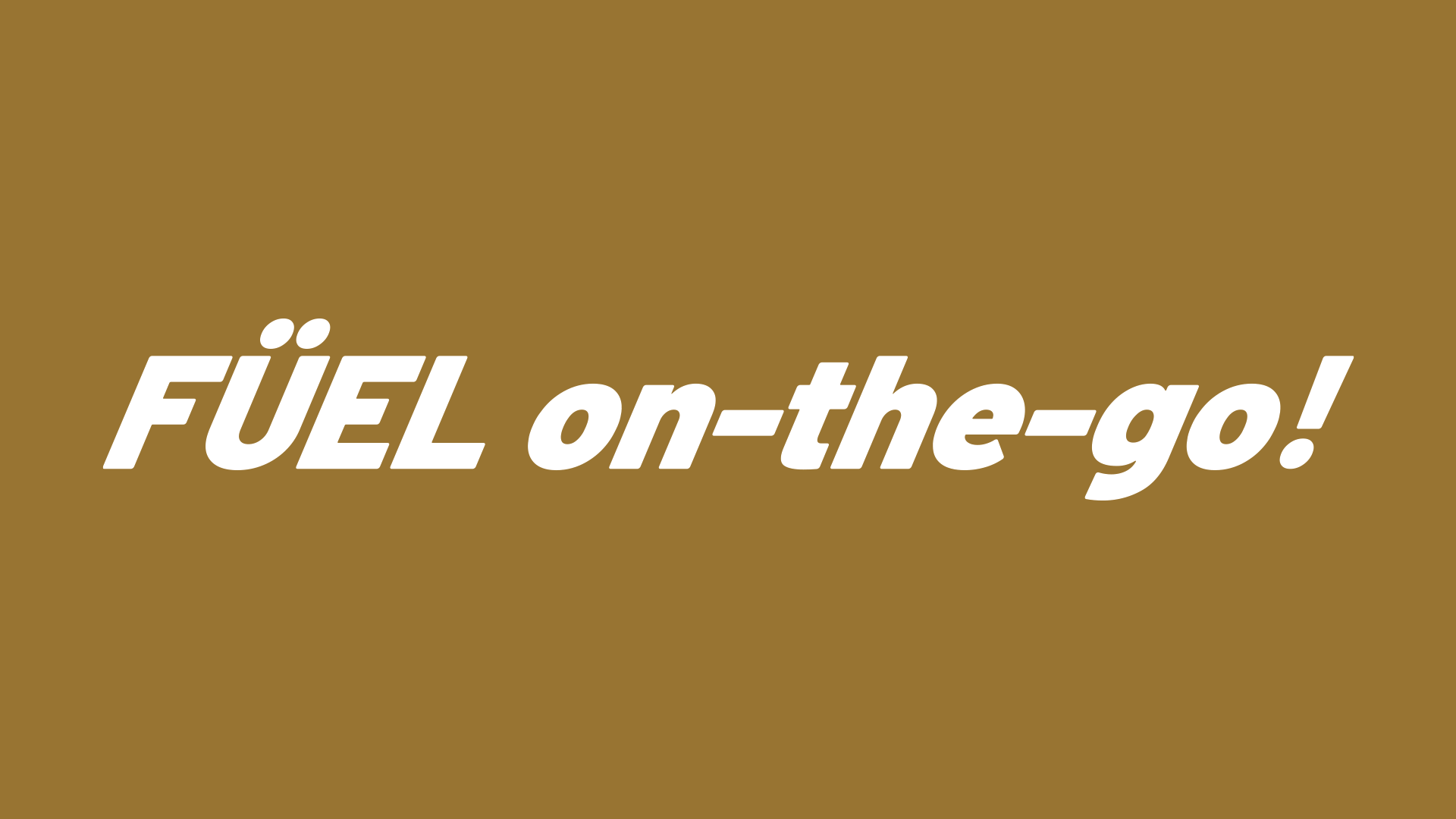
FÜEL on-the-go!
Healthy snacking made convenient
What’s small yet packs a punch?
A little go-to snack pack to keep the hunger pangs down when you’re on the move! Our recurring client, Big Nüts, came to us with an idea to create smaller pouches of their best-selling healthy snack foods for the ease of their consumers.
SCOPE OF WORK
Product Brand Identity
Packaging Design
Copywriting
Tapping into the client’s extensive product catalogue, we created a dynamic motion wave as the centrepiece of the product’s key visual. The wave creates a perception of perpetual movement, emphasising the idea of fueling on the go. The concept, along with its name – FÜEL on-the-go, aligns with the brand’s focus on providing compact, healthy, and convenient snacks for people who are constantly up and about. The kinetic illusion of the wave also allows the product packaging to catch the viewer’s attention as well as stand out on a shelf of stationary goods.
We extracted hues from Big Nüts’ ingredients to form abstract representations of the wave, showcasing a visual synergy that reflects the products in this series - a harmonious blend of ingredients coming together to produce an array of energising snack products.


To pair with the dynamic vibe of the packaging, we also came up with a series of playful short messaging for each individual packaging. This allows the brand to communicate with its intended audience as well as infuse life into an otherwise static product.
As for the outer packaging, they are given a series of fun, vibrant colours that will resonate with the intended younger crowd. The eye-catching colours also allow FÜEL on-the-go products to stand out amongst other products when shelved together.
Healthy fuel for healthy lifestyles!
Füel-on-the-go is the perfect portable, power-packed, and yummy snack for those on the move!
Dynamically designed to appeal to coffee lovers, busy bees, and health food connoisseurs, FOTG is available in (the Big Nüts) store, cafes, and online to grab and go!


W3RK Team
Client: Big Nüts
Strategy Director: Daniel Joseph
Creative Director: Tang Chen Hooi
Writer: Zoe Tan, Phornchita Eron
Designer: Kok Yip Wing
Motion Designer: Chua Eng Lam